

Act I · Access Realty
Make them see it
Everything a buyer experiences before a single brick is laid.
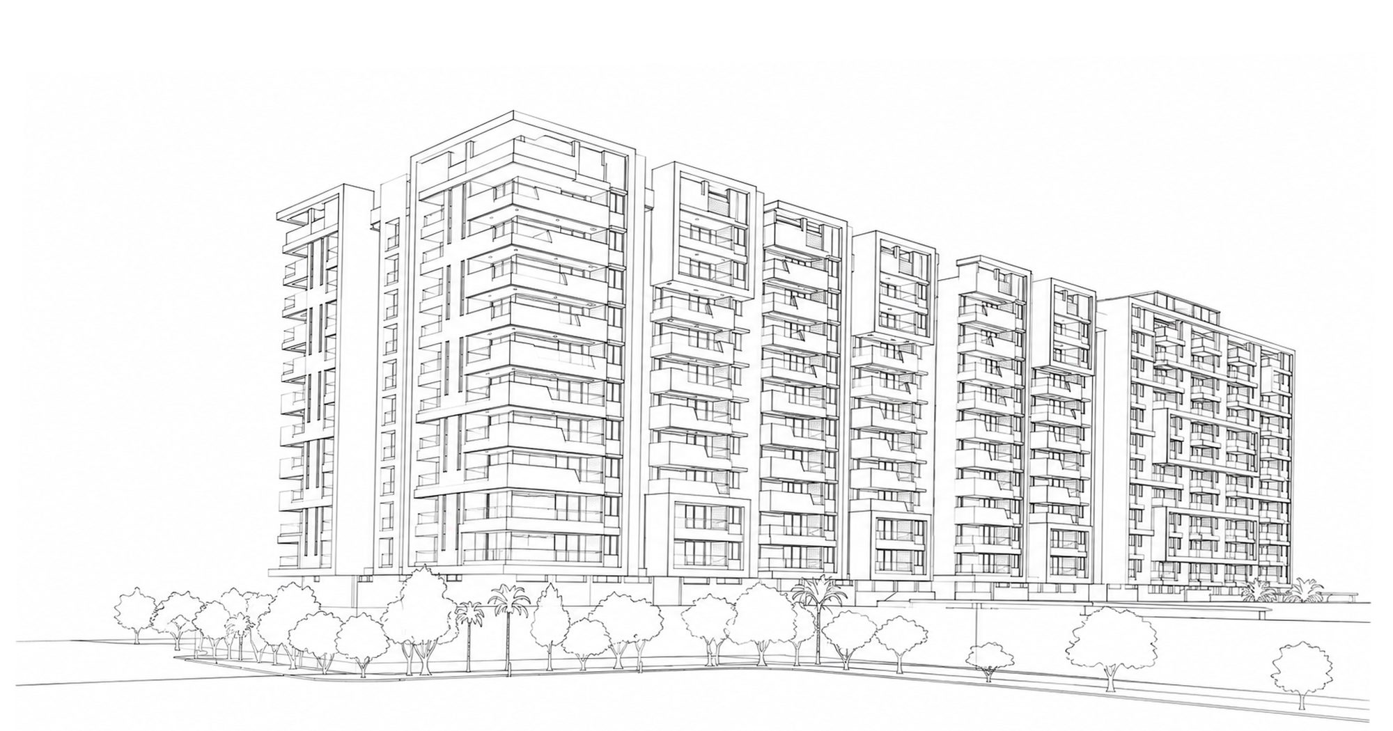
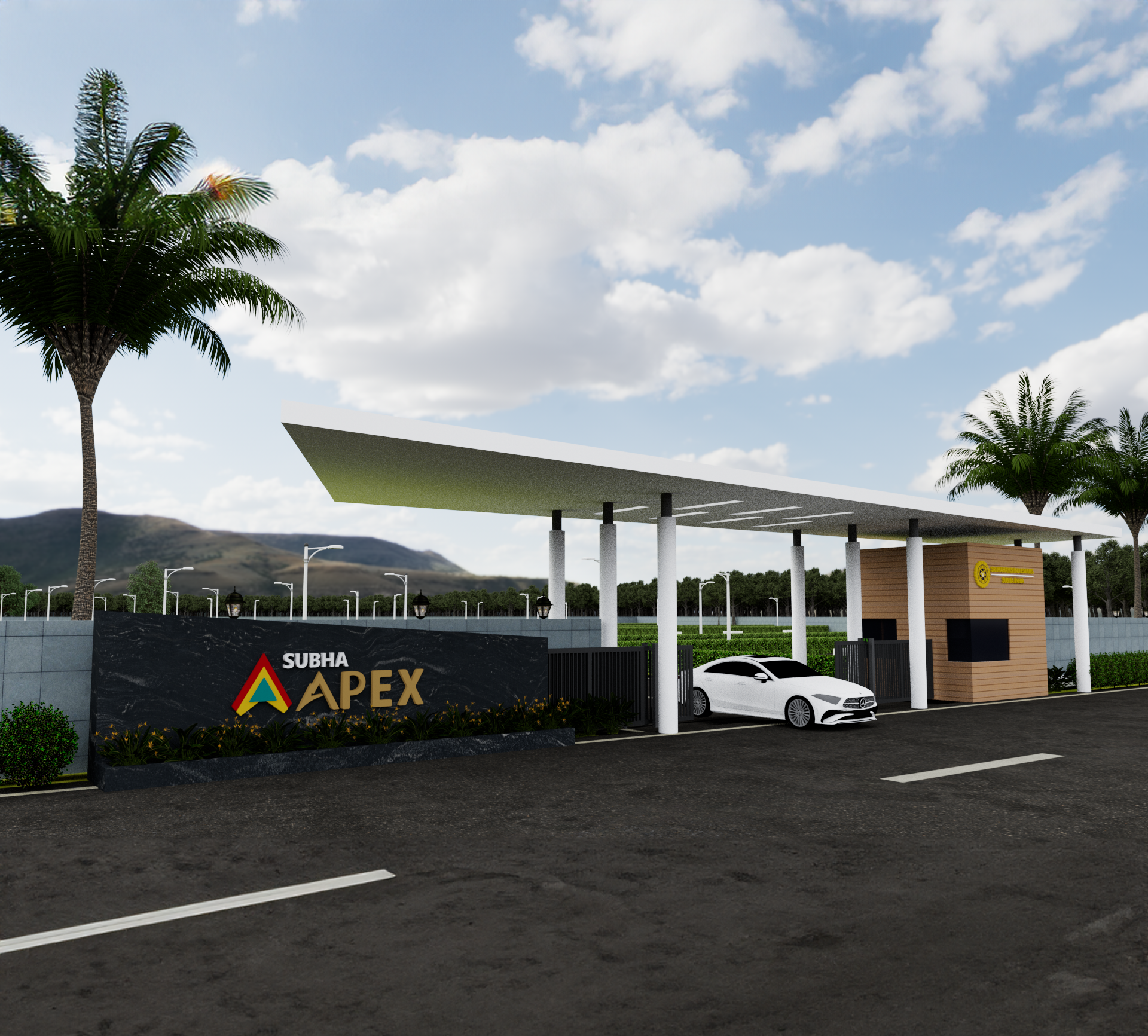
- Photoreal CGIStills indistinguishable from photographs of buildings that do not exist yet.
- Cinematic property filmLight, score and story. A launch film, never a slideshow.
- AI and VR walkthroughsBuyers walk every floor of your tower from anywhere on earth.
- Cohesive brand worldsOne visual language from brochure to hoarding. Every asset cut from the same cloth.
- Real estate websitesCinematic, fast and built to turn visitors into site visits.